IQ & reasoning • 6 min read • By RareScore Research Desk
IQ Score Ranges and Percentiles: A Practical Chart
Use a clear IQ score and percentile guide to understand averages, high scores, uncertainty, bell curves, and why ranges vary between tests.
What to know before reading further
- A percentile is the percentage of the reference group scoring below a result.
- Percentile spacing is nonlinear: a ten-point score change has different percentile effects in different parts of the curve.
- Charts are approximate unless they match the exact test, norm group, and standard deviation.
- Use the publisher’s norms when a formal decision depends on the conversion.
This guide answers: Convert a standardized IQ score into an approximate percentile and understand the assumptions behind the chart.
A chart is a coordinate system
Score bands are convenient because they convert a continuous distribution into named regions. The convenience can create a false boundary: 119 and 120 may receive different labels even though the difference is smaller than ordinary measurement uncertainty. The line belongs to the chart, not necessarily to the person.
Use the chart as a coordinate system. It tells you approximately where the score lies and how crowded that region of the reference distribution is. It does not explain the shape of the person’s abilities, the conditions of testing, or whether the difference from a nearby score is meaningful. Those require the profile and the uncertainty around it.
A score chart is a translation tool, not a verdict
IQ charts translate standardized scores into approximate percentiles and descriptive ranges. They are useful because a number such as 115 is difficult to interpret without a reference distribution. The chart gives context by showing how far the score sits from the center.
Exact percentile conversions depend on the scale and assumptions used by the test. Many familiar charts assume a normal distribution centered near 100 with a standard deviation near 15. An online assessment should state when its figures are model-based estimates rather than norms from a representative population sample.
How to read an IQ bell curve
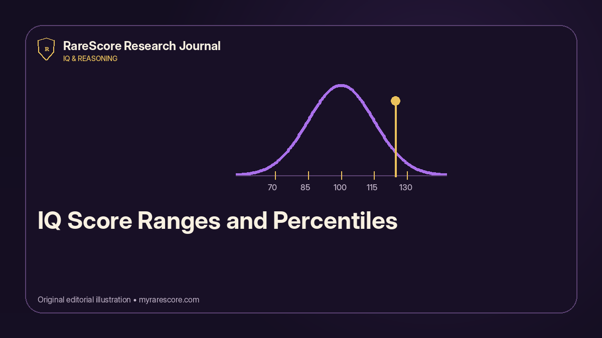
The tallest part of a bell curve represents scores near the center because more people cluster there. The curve narrows toward both ends because extreme scores are less common. The area to the left of a point corresponds approximately to that score’s percentile.
A bell curve is not a ranking of human worth. It is a mathematical picture of how a particular measurement is distributed in a reference group. It says nothing by itself about character, creativity, wisdom, effort, or opportunity.
Approximate score bands people commonly discuss
Common descriptions place scores near 90 to 109 around the broad average range, with higher bands described as above average, high, or very high. These labels are not universal, and professional instruments may use different terms or interpretive rules.
The most responsible way to present the bands is as approximate context. A report should avoid pretending that a one-point difference moves someone into a completely different kind of person.
- Below 85: lower than the central reference range on many scales
- 85–114: broad central range used by many summaries
- 115–129: clearly above the reference center
- 130 and above: uncommon high performance on the measured tasks
- Any boundary should be interpreted with uncertainty and test quality in mind
Why confidence intervals matter
Every observed score contains measurement error. Fatigue, attention, guessing, item selection, and testing conditions can shift the result. Professional reports often provide a confidence interval to show a plausible range around the observed score.
For online tests, even a simple disclosure that the score is estimated is better than false precision. A result of 127 should not be treated as meaningfully different from 126 merely because the website displays whole numbers.
Percentile is not percent correct
Percent correct is the share of available points earned. Percentile compares the result with other people in the reference group. A difficult test might convert a relatively modest raw score into a high percentile, while an easy test could produce many correct answers without strongly separating performance levels.
This distinction is especially important when a test uses weighted questions. Missing one very difficult problem may matter less than repeatedly missing easier questions that most of the reference group answers correctly.
Use the chart to ask better questions
After locating the score on a chart, move to the dimension breakdown. Was the result driven by deduction, spatial reasoning, pattern recognition, probability, or verbal logic? Were errors concentrated in timed items or ambiguous best-answer questions?
The chart gives a location. The analysis explains the route. Both are needed for a useful interpretation.
Examples make percentile differences easier to understand
Imagine 1,000 people from the same reference group taking the assessment. A result near the 50th percentile would place roughly 500 people below and 500 above. A result near the 90th percentile would place roughly 900 below and 100 above.
This example describes relative standing, not the number of correct answers. The raw score needed to reach each percentile depends on question difficulty and the performance of the comparison group.
Do not compare charts without checking the scale
Different publishers may use different standard deviations, age norms, score ceilings, and descriptive labels. A score of 130 on one instrument is not automatically equivalent to 130 on every online quiz.
When comparing results, use the same test version, similar conditions, and enough time between attempts to reduce practice effects. The category breakdown is often more stable and useful than small changes in the total.
Why percentile gaps behave strangely
On a scale with a mean of 100 and a standard deviation of 15, a score near 100 is around the 50th percentile. A score around 115 is roughly the 84th percentile, and a score around 130 is roughly the 98th. The score increases by the same fifteen points each time, but the percentile gain shrinks because the upper tail contains fewer people.
This is why “ten percentile points” and “ten IQ points” are not interchangeable. Percentiles rank positions; they do not have equal intervals. The difference between the 50th and 60th percentiles is not psychometrically equivalent to the difference between the 90th and 100th—indeed, the 100th percentile is not a practical observed point in a finite norm group.
If an online site displays a bell curve, it should state the assumed mean, standard deviation, comparison sample, and whether the position is modeled or directly normed. Without that information, the graphic may be decorative rather than explanatory.
Use this checklist
- Confirm the assumed mean and standard deviation.
- Use the exact publisher norms for formal interpretation.
- Remember that percentiles are ranks, not equal intervals.
- Do not treat category boundaries as sharp psychological divisions.
- Pair the chart with the cognitive breakdown and uncertainty.
What the evidence supports
Bell curves and score bands are useful visual translations, but they can make estimates look more exact than they are. The chart should always remain subordinate to the test’s actual norms and confidence information. Use it to understand relative location, not to create a rigid border between kinds of people or to compare numbers produced by unrelated instruments.
About the RareScore Research Desk
This guide was reviewed for claim strength, source quality, originality, and practical usefulness. The Research Desk is an editorial function, not a licensed clinical service. See the editorial standards and writing-process disclosure.